Genially is a cloud-based platform for building interactive learning and communication experiences.
Diagram templates by Genially
Trying to help your students understand a scientific process? Presenting your sales funnel to the team? Diagramming is useful for any audience and topic, whether you’re teaching kids about the law of gravity or presenting a risk analysis to the boardroom. That’s because infographics and illustrations help our brains visualize figures, timescales, and the links between systems.
You might think you need pretty good design skills to make anything more impressive than a PowerPoint pie chart. Say hello to Genially infographics. Our free diagram templates enable anyone to map out animated flow charts and eye-catching network diagrams.
Genially is intuitive and easy to use. Just choose a free diagram template, customize, then add to your presentation, slide deck, business report, website, or teaching materials.
All of our diagram examples are built by professional designers with animated graphics that come to life on the screen. That means icons that light up, colorful charts, and floating arrows that move in the direction of the data flow. Best of all? Genially diagrams are interactive, so you can engage your audience with fully responsive gantt charts, clickable graphs, and dynamic process flow diagrams.
What’s an interactive diagram?
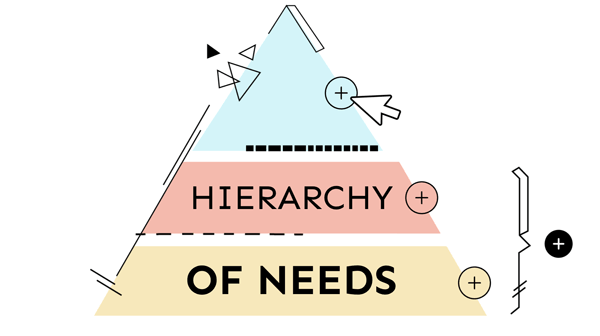
An interactive diagram is a responsive infographic with clickable buttons, pop-ups, links, windows and more. With Genially you can add interactive elements to all types of flowchart and diagram. That means labels that appear when you mouse over a bar chart. A text box that appears when you click on a section of a pyramid diagram or funnel chart. Or even sound effects and audio to explain what’s on the screen.
Interactive diagrams are highly engaging and more user-friendly than static charts and graphics. That’s because your audience can explore step by step, without being overwhelmed. By layering information in this way, you can depict a detailed business process flow on one presentation slide. It’s more fun to read, and more accessible for everyone.
Genially’s free diagram templates all contain pre-built interactions and animations. You don’t need any design or coding skills. Just choose a template, customize, then add the interactive diagram to your presentation slides, reports, website, teaching materials or training platform.
Which kind of diagram do I need?
The Genially template gallery includes hundreds of customizable chart templates for project management, marketing, sales, education, and more. Which diagram is best for you depends on your audience and the type of information you’re presenting.
If you want to illustrate the relationship between different items, categories, or groups, choose a venn diagram template. It’s similar to an onion diagram, which helps you visualize dependencies within a process or organization.
Need to show a process, flow of information, or sequence of stages? Opt for a funnel diagram or flowchart template. They’re ideal for presenting sales processes like your leads pipeline or business development roadmap. If you’re managing a project, you might prefer a process chart to visualize your workflow.
Need to depict a hierarchy, network, or decision-making process? Opt for a tree diagram. Each branch represents the outcome of a decision or chain of command. Tree infographics are also helpful when you need to show the relationship between people involved in a project or network. Two of the most common examples are organizational charts or family tree diagrams.
How can I make cool diagrams?
If you’re looking for something a bit more impressive that a PowerPoint diagram, check out the Genially template gallery for heaps of creative examples of diagrams. Browse the collection for colorful process flowcharts and standout alternatives to arrows and circles.
What about a fishbone diagram? Also known as an Ishikawa diagram (in homage to the guy who invented them) they’re a great tool for problem-solving as they depict cause and effect.
Ever tried using a bow tie diagram? Originally designed for risk management, they help you weigh up threats and the gravity of the potential consequences.
Perhaps you need to depict physical spaces and the relationships between them. If that’s the case, go for a bubble diagram: a really popular infographic with architects and interior designers. Take a look at our range of free diagram templates and get inspired!