Coffee with Genially
Designing for Change at the United Nations
Benjamin Cutivet-Løzninger, Design Lead at the UN DPPA Innovation Cell, shares how design goes beyond aesthetics to challenge assumptions, simplify complexity and turn ideas into action.
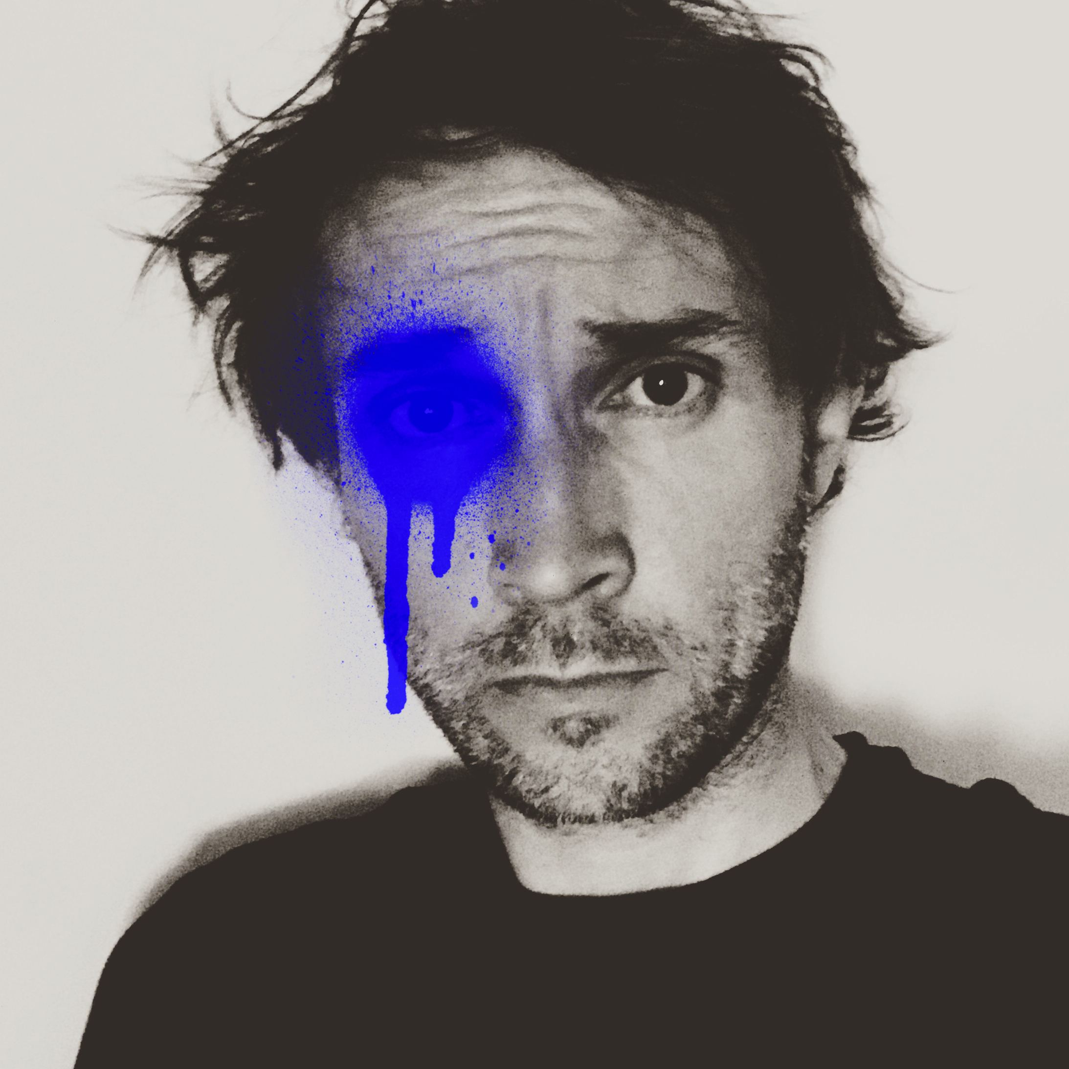
Benjamin Cutivet-Løzninger
Design Lead at the United Nations DPPA Innovation Cell
United Nations
LinkedIn →French designer, visual artist and filmmaker, and Design Lead at the UN DPPA Innovation Cell, where he turns complex issues around peace and diplomacy into clear, human-centered experiences.
Episode summary
In this episode of Coffee with Genially, Karla talks with Benjamin Cutivet-Løzninger, Design Lead at the United Nations DPPA Innovation Cell, about how design can challenge assumptions and drive change inside a large organization. Benjamin explains how physical spaces, foresight posters and games help people question established ways of working, from replacing cubicles with a glass conference room to creating the first innovation space at UN Headquarters in New York. He also shows the interactive map he built with Genially to showcase innovation projects from UN missions around the world, and shares how he conveys sensitive, complex topics in a diplomatic context without oversimplifying them. His definition of designing for change: creating the conditions for people to see a problem differently and turn ideas into action.
Mic drops
“If my grandmother can understand it, it's good. We're on the right track.”
“Designing for change is creating the conditions for people to see a problem differently, and not being passive about it.”
“Designers, follow your heart and don't be scared to explore different areas.”
Full transcript
Hello and welcome to another episode of Coffee with Genially. I know it's been a minute, but I'm very excited because we have a very special guest today. We'll be talking about one of my favorite things, which is design. Today we are joined by Benjamin Cutivet-Løzninger, a designer, visual thinker and innovation professional, currently leading design and visual thinking at the United Nations Innovation Cell in New York. Let me bring him on camera. Hi Benjamin, how are you?
I'm great. Thank you so much for accepting our invitation today. I have my coffee. I'm ready.
Awesome. Benjamin has a background spanning the private sector and international organizations. He explores how design can inspire change, challenge established ways of working and turn complex ideas into meaningful experiences. So Benjamin, to begin: you've worked in a lot of different companies, in the private sector and now in the nonprofit world. I'd like our audience to get to know you a little better. Who are you?
Thank you, Karla. I started at an art school in France. At that time I was learning art direction, visual communication, design and graphic design, but I was already interested in filmmaking and did a lot of it. A workshop had just opened there, so we were actually making more films than graphic design at the time. I also started making music, which was another thing in my portfolio. Fast forward, I started freelancing after school. I helped a friend who had a booking agency in Paris, which mixed my two passions, graphic design and music, and I created the whole branding for him. Fast forward again, at some point I arrived in New York and started working with big organizations there, like Coca-Cola North America, and was introduced more to the strategy side of design: design thinking, foresight, speculative design, all these things I only knew slightly. That was the very beginning of my career. I didn't really set out to work for a nonprofit, but I was interested in something more meaningful, with a purpose. Then life happened: I had to go back to France after this period. I had a daughter in New York, and my visa had expired, so I wanted to find a way to come back, at least for my daughter. This is where the universe was in sync and sent me the proposal from the UN. They were creating this Innovation Cell at the time, a brand-new cell. I think the boss at the time sold it to me as being like the Mindhunters. I don't know if you've seen the Netflix series, but I was really into it at the time, so I was very appealed and intrigued. I passed the interview and the same night they asked me when I could come back to New York.
How long have you been working there?
Since 2019.
Wow. Seven years.
Yes, it's crazy. Time flies. The first time I arrived, I remember the director at the time reminding me that I was there for three months. My contract was three months, even if my boss told me not to worry. Six-plus years later, I guess I convinced them that design was worth it.
That's awesome. Now that you have worked at the UN for seven years, coming from a different industry like Coca-Cola and other private sector companies, what did you have to change in the way you work? What did you have to relearn or rethink about being a designer when stepping into this whole different environment?
That's a good question, because honestly I felt a bit like I was starting over. I had moved quite fast in my career, but I had also done a lot of startups, which is good to learn from, because everything is there to start and to build. Weirdly enough, it was the same spirit at the Innovation Cell. They wanted someone with a startup spirit, too. Everything was to be built and quite experimental at the very beginning. And because it was experimental, you had to convince the leadership even more. You can imagine the levels of approval and validation at the UN: it's not because your direct supervisor approves a project that your director or the level above will approve it. So we did a lot of experimentation like this, building a project and then starting over because one layer wasn't approving it. Bureaucracy, a lot of things together. We all have this cliché of design just making things pretty. It's a cliché, obviously, but I had to convince them that it was not just beautification. It was really about conveying and improving the message in a more impactful way.
So in one word, would you say the biggest difference between these two sectors for a designer like yourself is bureaucracy, all the layers of approval you have to go through, or budget, or something else?
I would say bureaucracy, because it's very specific to this organization. Even when I was working with Coca-Cola, at a pretty high level, the directors of the team had decision-making power. At the UN, you really go one step after another to get the work approved. So yes, bureaucracy was a big thing. But again, when you work in the private sector you still have to convince the client anyway, so it's quite similar in a way.
Since we're on that topic: when you entered an organization where design has traditionally been about aesthetics and left out of the conversation, how did you convince leadership that design is more than making things look nice, that it actually has a deeper meaning?
I guess it's about solving problems in the end, with impact, and conveying the message. Our Innovation Cell was very experimental, so we had some margin to navigate between art, policymaking and very abstract things, at least for people who are not familiar with these topics. But the way I proved it and convinced them was really by showing them. I did a lot of mockups and prototypes to show them the before and after. And I always kept in mind that it should be for everyone, because at the UN the audience is so broad. It could be literally anyone, from very specialized analysts to the general public. You have to keep this in mind all the time, simplify as much as possible and make things understandable. I used to take the example of my grandmother: if my grandmother can understand it, it's good. We're on the right track.
Perfect. Do you have any specific projects where you thought, "This made a real impact," where you switched from something just aesthetically pleasing to something that actually worked? You don't have to be specific.
Sometimes it's hard to realize the impact. We work from New York, so we don't know exactly what the impact is at the end of the chain. But there are so many projects we have done with people in the field, in very complicated locations and conflict areas. Whatever you do, even if it doesn't seem like much at our level, it improves the work of people in the missions and in the field. Without going too much into detail, we've built a couple of web products and platforms to analyze data or scan social media, all to make the work of these people much easier.
Awesome. I know you wrote an article about using design to inspire change. What does that actually mean in practice, and how can design move an organization from simply communicating an idea to actually changing the way people think about the work?
That specific article was more about the physical space, which was part of my work. That's the amazing thing at the UN: all the different areas I had worked in before, for different clients, were suddenly all in the same pot. I could do everything: web, graphic design, print design, digital design, social media, physical space, videos, and probably some I'm forgetting. It was amazing to see how physical space can influence the work and the state of mind of people at the UN. At first, people were not convinced at all: why are you doing this? For example, we replaced the old cubicles by building a conference room with glass and a lot of light, and we put up a neon sign. People in the private sector know this kind of WeWork spirit. We created a branding for it aligned with our work in DPPA. At first everything was "Why are you doing this? Why a neon?" And eventually people were using the space on a daily basis. The neon was a bit too much for them, though. They would ask, "Why don't you turn it off today?"
Exactly.
It was a test we did in our own office. Following this, we had the opportunity to create the first-ever innovation space at UN Headquarters in New York, and that was a big project too. We consulted some design companies, but our budgets are very limited, so in the end we did everything ourselves, even the painting. I painted a mural at Headquarters, which still feels pretty surreal after all this time. To carry on in this spirit, it's about challenging people all the time. It's about foresight and design thinking: you think you know some things, but what if you've forgotten some options? That's also part of our work: challenging, asking questions, asking why you didn't try this other option. We create scenarios like this through games and web products. We also did a lot of posters that challenge people by recreating situations at the UN, but in the future. I can maybe show some later. Again, it's about using the whole spectrum of design to convince people that they can do more and probably haven't explored all the options yet.
I love that you mention challenging people, because here, in the context of Genially, instructional design and course creation, a lot of our instructional designers say you have to challenge people, or add gamified experiences that make the audience interact and think twice before answering. So I find it really interesting. Even when we're talking about physical space, an office space, good design makes you rethink something. It's not just straightforward: you start building different thoughts in your mind as you experience a design or a gamified experience.
Totally. As much as you want to be open all the time, I feel we are all biased, and sometimes it's very hard to realize how biased we are. We work on this at the UN too, obviously, to try to fight it. But there are so many design thinking tools and methods out there to help you challenge yourself. You can even do it on your own.
Since we're talking about this, for the designers, instructional designers and creative professionals listening to this podcast or watching this video who want to use design to inspire change in their organizations: could you define in one sentence what it means to design for change rather than just designing for aesthetics?
That's hard, but maybe designing for change is creating the conditions for people to see a problem differently, and not being passive about it: trying to turn the idea into action.
That goes along with a webinar we did with Genially, the five-minute hack, where we talked about how the passive brain can turn into an active brain when you do certain things, like involving the audience. We showed how static content, when made interactive, can activate a part of the brain that helps people remember more. It goes so well with that webinar. I love that. If you want, we can take some time now to show the interactive map you built with Genially for one of your projects, the Innovation Course. Thank you for collaborating with us. We're really glad you're using Genially, and I'd love to explore how you use it and show our viewers how they can simplify an idea through interactivity.
Totally. We have a yearly training, since 2019 actually, since I joined. The format is an online training with specialists across different fields: data analytics, geospatial analysis, graphic design, even design thinking. We've done this for six years, and a lot of innovation projects came out of these sessions. All these people are staff members across the UN missions around the world, and we wanted a repository showing the most interesting projects. Honestly, I wanted something very simple to build, and simple for my colleagues to update. That's how I came across Genially. That was the first project we did with Genially, and building it was very easy and intuitive. To show you how we built it, we have several areas here: LLM, digital dialogues, foresight, innovation community. The map shows where things are happening. We have a lot in New York, obviously, but you can see projects everywhere in the world. If I switch on the interactive version, you even get little animations. Let's see, for example, Bolivia: we had a digital dialogue there, and you get the link to the video explaining why this person took part. Digital dialogues are another of our projects, which we run in conflict areas, giving a voice to people who don't really have one, mainly youth and women, sometimes in contexts like pre-election periods. So this is an easy way to show all the innovation projects.
It's very user-friendly. You can explore the map at your own pace.
Oh, here's the innovation space I was talking about. And my mural.
It's a nice mural. Is that the one you painted by yourself?
I did.
That's awesome. How long did it take you to build this interactive?
Honestly, not much. I added some layers and explored, refining the text, but as you can see the end product is quite simple. It's still very useful for people to have everything on the map, to be able to click, go directly to the projects and see what's out there. Even if we spread the word, the UN communicates every single day, and there's a lot of information coming from different organizations across the UN. Innovation is probably not the main focus, even if we're trying hard and we think it's the future. So small products like this are still quite useful.
Are you the only one working on this, or do you have other team members editing and using Genially?
I have some colleagues using Genially for other things. We also use it to create modules, for example to embed in other websites, because it's so convenient, so interactive and so easy for everyone. Honestly, you don't have to be a designer. There are so many templates that are easy to use. I didn't even have to convince my colleagues: they convinced themselves that it was really useful and easy to use.
Awesome. Do you have any other projects you'd like to show us today?
I can share our Behance page if you're interested in knowing a bit more. It's "DPPA Innovation", in one word. It's a panel of all the different projects we've done. We did a lot of VR at one point, VR experiences that let you go to the field without leaving your office, to create empathy among decision-makers. There's the training I was talking about, the Innovation Course. We have GeoGuard, a big platform we worked on for geospatial analysis, trying to find correlations between climate change, water scarcity and conflict. Again, a lot of projects in six years. I could go on. I can show this one, which I mentioned briefly: we curated a series of posters about foresight and speculative design. We worked with a concept artist who created this whole series. Let me zoom in a bit. They show different situations you would find at the UN, like a peace negotiation, transported 50 years from now, to see how you could have different technology. For example, this robot would be a confidentiality robot: you could talk and share secrets without worrying about your surroundings, because it would add white noise or whatever you want. All these different things we put in there are, again, meant to challenge people, so they ask questions and trigger new thinking and, hopefully, new ideas for their daily work.
That's awesome. There are so many different projects: physical spaces, graphic design, course design. You see design in everything you do. It's just different ways of showing it. Since we're talking about design and how broad and diverse your audience at the UN is, whether you're designing for your coworkers or for the general public, how do you design for an environment like this without losing the people you're designing for?
Like we were saying earlier, it's never, or very rarely, a single audience. That makes it more complicated and, at the same time, simpler in a way, because you have to design for everyone, so at least you don't have to worry about defining the audience. My direct colleagues are different people, obviously. Like I said, we were a bit the team of aliens at the UN, because we do a bit of everything. Some of my colleagues had never done graphic design or video scripts, but we all collaborate on things outside our comfort zone, even if I'm the focal point for all things visual. I would say the challenge is to navigate complexity in an organization that is sometimes very sensitive. There are a lot of things you can say, but even more that you can't. That's where it gets very complicated. Especially because we're part of the diplomacy area, everything is about language. The visual is important, obviously, but how you convey the message, the text, is even more complicated. My colleagues help me a lot with that. In the end, it's always about conveying the message in the best and most impactful way.
Awesome. And on complexity, not only in the sense that your audience is diverse: how do you make something easier to understand without oversimplifying it or losing what makes it complex? There are a lot of conflict zones and different programs at the UN. How do you convey them without oversimplifying the context or the problem?
There's a lot of back and forth for that. There are usually a lot of prototypes and tests, sent to the different focal points for the specific design work we're doing. For example, I still do print design. We just did a huge report, a kind of overview of all the special political missions at the UN. This document had never been done before, so it was a big thing we wanted to do for the UN. The specialists in this topic were involved, so again, a lot of back and forth. Even about the design itself: why are you adding these little ornamental things when it should be more straightforward? I tried to explain that it may look like beautification, but it's not only that. You make the document more appealing for a certain audience, because in the end it's a public document. It could be read by researchers, academics.
How do you balance that back and forth? I'm guessing you come up with a design where you think everything has a purpose, and then you get feedback saying "I don't like this." You have a lot of stakeholders to keep happy. How do you balance getting feedback and redoing what you've already designed?
First, I'm very patient. I'm a big listener. Honestly, even after a long career, I feel I'm always learning, and I know these people know much more than I do about these topics. Every time, we really try to find a balance between the design and the purpose. Again, a lot of back and forth. Sometimes I try to convince them that they're not totally right and that we should keep this or that. I think it's a lot about respect. I think they really respect my work now, and the work of graphic design. That's what I'm most proud of: after all this time, I really see that they see the value in graphic design. The best proof is that they're still consulting me and I'm still working with them.
It's so great that it's not just the work you put out there, but also the change within the organization and how the value of design shows within it.
Totally. And it's not because it's the UN that it should be old-fashioned. It's not. It's also hard to talk about the UN as one big entity, because there are so many different departments and organizations under the UN. Even having a common language is almost impossible, because everyone has their own agenda and way of communicating. Even at the level of a department, there are divisions, and then our cell. Again, bureaucracy: lots of different layers and levels. But I feel we've already won over our division, and now we've also managed to convince our department. We're trying to create more visually appealing assets for social media, for example, where I've done a lot of small animations and videos lately.
Awesome. To wrap up our conversation, what advice would you give young designers, whether instructional designers or designers in general, who want to inspire through their work and have a diverse audience to keep engaged?
I think it's more a life lesson that applies to design. I feel designing your life is the way to do it. Stay open. I never expected to end up at the UN, or at least I didn't know at the time that I wanted to. Obviously, it's very rewarding to work for a purpose, for the greater good, versus designing for drinks that make you fat. So, designers, follow your heart and don't be scared to explore different areas.
Thank you so much for joining us today, Benjamin, and for sharing your experience, ideas and perspective. It was a pleasure having you, and I'm excited to keep seeing your work and how you inspire change, whether you're at the United Nations or outside of it. Hope to see you next time.
Thanks so much, Karla.
And to our audience, thank you for joining us for another Coffee with Genially. We hope Benjamin's perspective on design, innovation and inspiring change gave you some fresh ideas to take into your own work. See you next time. Bye, everyone.
Bye.